A poem, a mother, Haverman and Claude McKay

My Mother, a poem by Claude McKay (1922)

Hendrik Haverman, printing company “S. Lankhout”. This lithograph was an added print of an 1896 edition of “De Kroniek”
lithograph by Hendrik Haverman representing his wife and daughter, 1896.

Reg wished me to go with him to the field,
I paused because I did not want to go;
But in her quiet way she made me yield
Reluctantly, for she was breathing low.
Her hand she slowly lifted from her lap
And, smiling sadly in the old sweet way,
She pointed to the nail where hung my cap.
Her eyes said: I shall last another day.
But scarcely had we reached the distant place,
When o’er the hills we heard a faint bell ringing;
A boy came running up with frightened face;
We knew the fatal news that he was bringing.
I heard him listlessly, without a moan,
Although the only one I loved was gone.

The dawn departs, the morning is begun,
The trades come whispering from off the seas,
The fields of corn are golden in the sun,
The dark-brown tassels fluttering in the breeze;
The bell is sounding and the children pass,
Frog-leaping, skipping, shouting, laughing shrill,
Down the red road, over the pasture-grass,
Up to the school-house crumbling on the hill.
The older folk are at their peaceful toil,
Some pulling up the weeds, some plucking corn,
And others breaking up the sun-baked soil.
Float, faintly-scented breeze, at early morn
Over the earth where mortals sow and reap—
Beneath its breast my mother lies asleep.

About the art & poem: The lithograph, by Hendrik Haverman, 1896.

 The poem: About.com education

Adriaan Keus

Dutch farm entrance by Adriaan Keus

An oil painting by the well-known Dutch painter Adriaan Keus 1875-1955. This work is representing a typical Dutch farm entrance, somewhere in Gelderland, a province of the Netherlands. This work was probably painted late in his career telling by the somewhat modest color-tones and the wooden panel it was painted on.  I’m guessing somewhere around 1930-1940. The painting has some craquele in the lower right corner, see the pictures. The work measures ca. 31 x 24 cm. The frame is 42 x 36 cm. On the back of the panel is a note attached, a short summary of the painters career and ouvre.

Its signed in the left corner by Keus. A lovely Dutch work!

Price: 189 €  (exclusive of additional shipping costs) 

Click on the images for a larger view of the artwork.

If you are interested in purchasing this work or if you have additional questions, please use the form below.

Sold—-> After Matthäus Schiestl

Religious painting after Matthäus Schiestl.

bestand_002-27

A wonderful painting by an artist named Emmer or Emner after a painting of the Austrian painter Matthäus Schiestl.
The original painting by Schiestl is located in the Mariendom in Freising, Germany. It is one of the paintings by Schiestl that were embedded in the “St. Johns altar”, a Neo-Gothic altarpiece. In the right lower corner of this painting it says “Copie” and the name Emmer or Emner. On the left Schiestls autograph.
An old black and white photo was attached at the back of the painting. It looks like a priest or someone in service of the Catholic Church. Since this is not an exact copy of Schiestls painting but it differs on some points, it could very well be that a church or catholic person ordered this painting to be made.

This big painting measures 83 cm x 70 cm.

The picture is framed with a original robust brown frame. The frame has some spots but nothing serious.
The painting has a new layer of lacquer and a few damaged areas are retouched. You can read about this process here: Cleaning an old painting  .
Some craquelure still is visible on the painting.

The website with information about the altarpiece and the Mariendom.

Price: 475 €  exclusive of shipping costs. 

Click on the images for a larger view of the artwork.

If you are interested in purchasing this work or if you have additional questions, please use the form below.

A letter from Jan Mankes

Jan Mankes 1889-1920

A letter Jan Mankes wrote, while he was ill with tuberculosis.  The letter was addressed to a female friend and art collector. A few months later he died, thirty years of age.

mankeszelfportret_met_uil
Jan Mankes, self portrait with owl

“An August day can be so dusty and sobering”. “On these days you just want to disappear, escape all this misery imposing on you”. However you know: “the serene evening will come and the Lapwing, (a bird) will be heard over the lowlands”. When taking a walk in the early morning dew, looking at the backs of the cows, and the dampening trees, you know that just the thought of all these things justifies everything on such a fierce August day.  “You’re not to groan and curse”, “and you do not try to change it and improve it, you just seek out a quiet place somewhere on a deserted piece of land, and wait while knowing that it will come”.  Nature has nothing to hide, but gives everything, and those August days, they also have their place in our mental landscape. But the winterstorm nights, they will come, and so will the lovely mornings and evenings in may,  those are all intimacy.

Only that depth we get while living life through these extremes, together,  can make true friendships happen.

Will fate allow us to go through all these stages?


The Dutch version of this letter is found on the website: www.annezernike.nl

More art of Jan Mankes: The Darkness of Jan Mankes

Woodblock prints, Jan Mankes and colorblindness

I am “one in two-hundred females with color blindness”.  I can distinct primary colors pretty well, and find my self mostly struggling with some varieties of blended colors. I have always been drawn to artworks with lots of black tones like for instance those of the Dutch painter Jan Mankes, 1889-1920. When in a room with several paintings, like in the Museum of Arnhem, these are the ones that my eyes are drawn to. 

Selfy with owl Jan Mankes
Selfy with owl

When I first saw his work in our local art museum I was blown away by the paintings of Jan Mankes. The colors he uses, the topics of his works and even the small size of his paintings, accredit to the fantastic sober, dark and natural atmosphere of his artistic legacy. The frames that were used for his paintings, are made of wood and are often very broad and robust, also complimenting the petite fragile inner state of the paintings. Since that moment in the museum, (to me almost a spiritual happening) I became a big fan of his work. Most artworks by Mankes have that darkness that I like. A literal darkness. I think the scarceness of bright and light colors is in beautiful contrast with Mankes smooth, powdery and gentle streak.

MANKESUitzicht_atelier_te_Eerbeek
View from his atelier in Eerbeek

His sometimes unusual use of color and the dark blend, makes me wonder if Mankes might have been colorblind. It takes one to know one I suppose?

Darkness in old paintings, like that in the paintings of the great masters, Rembrandt van Rijn for instance, was often caused by the layer upon layer of yellowed and browned lacquer and the dependence on natural sources of daylight. Next to that, their paint and pigments where natural and made by following very precise alchemy recipes. Sometimes the pigments and the paint where poorly made. Turning black after long periods of time because the pigments in the paint turned out to be unstable.

Art lovers and artists themselves have come to associate the darkness in the paintings with the quality of the old masters. Later generations of artists have used special dark brown lacquer for their paintings in order to create that brown and yellowish veil over their works.

Porcupine, Jan Mankes woodblock
Porcupine Woodblock by Jan Mankes

I have recently read some of the correspondence of Jan with his friend and art collector Gouma (1882 – 1926) The way Jan writes about the weather, nature and his environment, makes me think he was a fan of “the dark days before Christmas “as we say here in the Netherlands and actually enjoyed those beautiful soft and natural colors that come with that time of the year. I came to understand that Jan was very inspired by the woodblock prints of the Japanese artist Hokusai and bought his very first etching press because he wanted to make prints himself. In 1913 he started with his first prints and I am glad that he did because the woodblock prints and etchings by Jan Mankes are of an exceptional quality as you can see here on the left. Portraying a prickly animal so soft and touchable with only black and white as an option is truly the work of a great artist. I must say that I am always scouting to hopefully obtain one of those great woodblock prints by Jan Mankes. They are being sold for absurd amounts of money here in Jan Mankes’s Lowlands.

Zilverwyandotte, woodcut by Jan Mankes

In 1920, Jan Mankes unfortunately died from tuberculosis when he was only 30 years old. He left a legacy of 150 small paintings, 100 drawings, and 50 graphics.

I have translated one of Jan’s many letters for reference: “A Letter from Jan Mankes”.


——-> SOLD, N. Maurin

Nicolas Maurin? 1799-1850

Romantic scene, marriage proposal 

 Maurin M.R romantic scene ca 1837?A beautiful soft colored and romantic antique lithography. Its is not clear to me if this lithographic print can be 100 % accredited to French master engraver “Nicolas Maurin” but the plate has the initials N. M in the left corner and the plate does look french to me. I have a similar stone-print, and that one is from 1847.

There are other plates known that are from this engravers hand that do have similarities with this plate, and he has done a whole series on the topic of marriage proposal.

It is impossible to tell without opening the frame. Aside from that, this is a beautiful anique stone-print, two toned, with hand painted areas as you can see by the close-ups of the print. A lovely original antique art print!

The frame measures 32 x 26 cms and the lithograph is 26 x 19 cms. This plate as shipped as is, framed.

Price : 75 Euro (exclusive of additional shipping costs)

Click on the images for a larger view of the artwork.

If you are interested in purchasing this work or if you have additional questions, please use the form below.

[contact-field label="Name" type="name" required="1"/][contact-field label="Email" type="email" required="1"/][contact-field

Alfred Moilick

A.Moilick  

Feeding deer, 1889

 A Moilick 1898, feeding deer, lithography.A beautiful colored engraving. This plate was an art addition to the German magazine “Zum Guten Stunde” around 1898. It would be a fantastic wall decoration with the right frame. For the lovers of high quality engravings, this is a very nice print, printed on thin glossy paper and of a very fine, crisp lined quality.

The dimensions of this print are: 28 x 21 cms and 23 x 16,5 for the lithographic image. In the left corner the autograph of the engraver, Alfred Moilick. On the right is printed “Deutches Verlaghaus Bong & Co, West Berlin”. Plate number 21, Moilick, Futterplatz fur hochwild. Outside the margins there is some soiling but overall this plate is of good quality.

Price : 17,50 Euro (exclusive of additional shipping costs)

Click on the images for a larger view of the artwork.

If you are interested in purchasing this work or if you have additional questions, please use the form below.

Before and after pictures

Before and after

Cleaning artworks is a very rewarding task. Here you can see some artworks that have been cleaned and restored. You can click on the before and after pictures to view the big version. You can use your zoom for the right resolution.

A Knilling engraving featuring 16th century European fashion. I removed the acidic build up in the paper by washing this 1870 print  in a Calcium hydroxide bath. To keep the the hand colored areas as good as possible I did not sun bleach the print after the bath but left the print as is.
Ed Jeska pastel drawing
Pastel by Ed Jeska, 1937. Artwork with water damage on both sides, I scraped of moldy patches, removed dirt on the backside, filled in the water-damaged areas with a new layer of oil pastel. Fixated the pastel crayon powder with fixation spray.
Bestand_000 (63)
Sabelspoort Arnhem, etching, I removed the acidic backing, and aqueously cleaned the paper with Calcium Hydroxide. It was then pressed, dried and sun bleached.
bestand_001-66
A  beautiful 120 year old frame with superficial damage. I filled in the damaged areas with putty for wood. After this some light sanding and painting the putty with light and dark gold paint. After this some black paint was used to re-create the patina effect to match the rest of the frame.
jaarsveld
After finding the right solvent gel, this wonderful painting by Arie Jaarsveld was stripped from its brown lacquer and returned to the Indian summer day as it was captured by the artist . Fantastic colors emerge.


Bestand_002 (28)
Herman Wiechmann postcard 1898. Aqueous cleaned. Retouched the cracked area. pressed and dried.
Bestand_005 (13)
“Cactus” woodcut by the Rol family 1935, aqueously cleaned, sun dried, highlighted foxing spots.
Art Deco Woodcut by A. Remiens 1920, removed tape, cleaned aqueous, pressed and sun bleached.
Matthaus Schiestl ca.1900, a copy of the work that is hanging in Domburg Germany. The lacquer is removed. I touched up and retouched some damaged areas, further more the painting was cleaned and I applied a new layer of lacquer.
krug
A cute panoramic lino cut by Han Krug made around 1935. The paper turned brown because of the acidic cardboard it was mounted on. It was carefully removed from the board and washed in distilled water with added calcium hydroxide. After this it was pressed and dried. Some cracks in the paper were than retouched and some areas re-enforced with Kozo paper. It was then mounted on acid free board, matted and framed.
Midderigh Bokhorst litho ca. 1936
A lithographic print by Midderigh Bokhorst, ca. 1935. It was washed, sun-bleached  and tares where mended with Kozo paper.

Cleaning paintings

The cleaning of an old painting

Schiestl before cleaning, removing the old lacquer
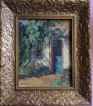
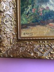
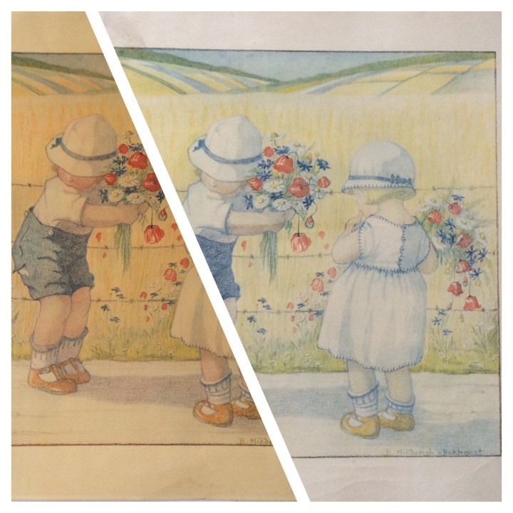
For some time,  I have been cleaning antique, old paintings. I bought a beautiful piece by Matthaus Schiestl,  made around 1913,  that could use some restoration and cleaning.  The painting had some “craquelure” , the breaking of the varnish into a pattern of  hair sized cracks. Next to this, the lacquer turned into a brown veil that “dulled” the image considerably. The painting looked dirty which lessened the the decorative value of this lovely painting. You can imagine this painting not looking to good contrasting with a white or very light wall in the background.

While very fine lines are caused by aging and can enrich a painting, wide craquelure, if not treated, can result in the deterioration of the painting. Wide and rounded craquelure has other causes then just time passing. The wide gaps allow moisture to penetrate the paint under the varnish where it will react and cause expanding of the paint. Of course, this process will not happen over night, this will take time. Schiestl’s painting did not suffer from problematic craquelure but the lacquer on this painting became very dark and had covered the painting under a brown veil. Removing this should greatly improve the colors as well as lessen the craquelure.

Right corner with damage

Next to the condition mentioned above, the painting had some minor scratch marks here and there. An excellent candidate for me to clean. It is a big painting, (83 x 70 cm) so I knew I was up for some late night hours and many, many, (actually a few thousand) Q-tips. With chemicals, I made two solvent gels, one with acetone and one with ethanol alcohol so I had an option to test which one worked best on what color. I started out with a little corner at the bottom of the painting. Both gels turned out quit well, although I liked the ethanol solvent best because this gel seemed somewhat more liquid when reacting with the lacquer, which made the removal of the old lacquer somewhat easier.

Some colors on the painting reacted when in contact with the solvent gels. I minimized the exposure time on those problem areas and neutralized afterwards with turpentine, but here and there was some paint lost.
These areas where later retouched with the appropriate colors. After the painting was stripped from its brown old varnish, I retouched the areas where some paint was lost as well as the spots where the paint was scratched.

These where firstly infilled with Gesso and after that, retouched with oil paint.  After an extensive drying period of the thinned oil-paint,  (several weeks) it was time for the painting to get a new layer of varnish.  I chose Windsor and Newton varnish, (with UV- filter and reversible if needed) This was applied it with a “Da Vinci” ultra soft lacquer brush. The removing of the old varnish took about 90 to 100 hours.

I used around 3000 Q-tips during this process and about a square meter of cotton cloth. Almost one liter of solvent-gel did the job of dissolving the old lacquer.

And voila! An explosion of color. Like it was made yesterday. More info about this painting, which is a remake of an existing work by Matthaus Schiestl, will be posted in the shop where it will be offered for sale.

It is for sale now on Etsy and via this blog:

Oh hail Mary by Emmer or Emner after M Schiestl


Reyer van der Borden

Reyer van der Borden

Aronskelken, Arums, 1928

Bestand_007 (6)
“Aronskelken” is a rare lithographic work by Reyer van der Borden, a Dutch painter, and graphics artist. It is an early work from the hand of this artist, who started his career in the roaring twenties when exotic plants where very popular in art designs.  The print is signed by van der Borden in the right lower corner, and on the left side it says, “Aronskelken”.

In the middle of the plate is the name of the printer found.  The name “Borden” is also hidden somewhere in the artwork. “Aronskelken” is a very big work by v.d. Borden, it measures approximate 75 x 59 cm for the frame and 63 x 46 for the lithograph.

The frame that is complimenting this neat artwork is something special too, it is an original art-deco frame by the “Venesta plywood company”. “Venesta” referring to the word veneer. This was an Estonian company with offices all over Europe, known for their practical furniture. This frame had some small missing chips in the veneer on two places, near the top left corner that are “touched up” by me. The wooden matte has some tidelines in it from moisture.

Click on the images for a larger view of the artwork.

Price: € 200 euro
(inclusive of additional shipping costs) 

If you are interested in purchasing this work or if you have additional questions, please use the form below.